Note: This article is based on the preview of Communication Sites
Microsoft announced the preview of Communication Sites in first release a little over a week ago. At first I was expecting more, but after playing more with it, it’s actually a pretty good preview when it comes to content layout. And with the new Hero web part, which let’s you manually highlight content/links, creating a nice looking landing page is much easier than before.
The main difference between a Communication site and a Modern site as far as I can tell are that a comm sites have no left navigation, and you have the option to enable commenting on the pages you create.
Note: Comments are stored in a column on the list item named Comments.
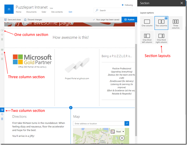
The coolest feature is that a page now not only consists of a single zone where you add parts after each other, but they consists of sections, which again have web parts.
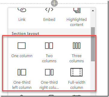
If you start with a blank page, this is easier to see. Picking a multi column layout or a single column layout basically gives you a predefined layout – but you can accomplish the same from a blank one.
Header control
If we start with the header of a news article, you can now change the image displayed behind your page title to get a more fresh looking header. If you want a solid color, for now you need to create a single color image and use that as your background. You can also choose to remove the image all together. This greatly reduced the need for my header hack part.
Default header
Header with custom image
Header without an image
Sections
Once the header is configured, it’s time to add content. First you will add a content section, and then you can start adding content to the different columns.
Below is a sample page where I have added three sections, each having different column layouts. It’s worth noting that you can not nest sections within sections, which is probably a good thing, as you would want the pages to work on smaller devices as well. It’s also possible do drag and drop web parts between sections and zones, and it’s working in all browsers which is not the case for oldskool web part pages.
On a mobile phone the page will look like the image below, wrapping the columns below each other.
What’s next?
Right now we can control the article headers and the layout of content in a page. If you want to add branding and for example a mega menu you have to turn to the SharePoint Framework dev-preview which allows you to add global headers and footers to all pages, adding that extra piece of branding your communication and marketing department demands for an intranet style site.
All in all, I’m quite happy with these new layout controls, and they will certainly help as we create more and more content on modern pages. Communcation sites does not have full feature parity with old style SharePoint publishing at the moment, but you can still accomplish approval and setting publish dates on articles by custom columns together with the highlighted content search web part. Or, you can wait as more features are being released or have your favorite developer create custom roll-up SPFx web parts suiting your exact scenario – same as it has always been.
After the summer developers will be happy to know that the PnP framework will have support to create all kinds of modern pages with sections and web parts – making it easy to orchestrate new pages.
Summary
From being a tiny bit negative when I first looked at this, to testing it a bit more, I have to say that this first release is a good step above what we had with the first modern pages, and I can see this turning into the proper successor of old style SharePoint publishing.


